Presenting Mortality data with R and LateX

Mortality, fertility and migration

What is the most informative way to present statistical dataset or actually time series data? Most convient way is to animate this data but how to do that with fastest and easiest way? Now I want to present one way to do that. Rob J Hyndman presented this data and animation technology in his blog on October 2010. Professor Hyndman presented French mortality data and how to utilize demography R-library.

In this example I will introduce how to present mortality, fertility and migration data from Finland. As data source I will use data from here: http://www.mortality.org/

To get data you have to register as a user in The Human Mortality Database (HMD).

Data source:
Human Mortality Database.  University of California, Berkeley (USA), and Max Planck Institute for Demographic Research (Germany). Available at www.mortality.org or www.humanmortality.de (data downloaded on 17.07.2012).

Finnish death rate (mortality 1x1) data table name is Mx_1x1.txt
and address is http://www.mortality.org/hmd/FIN/STATS/Mx_1x1.txt

Of course you could also use hmd function to get data from HMD (included in  demographic library) ie.

norway <- hmd.mx("NOR", "user", "pass", "Norway")
See more informaton about this from there.

Any way I downloaded Finnish data (23 Mb) as bulk transfer after registering above mentioned MHD service. In this case I do the following things:

STEP 1:

fin_mortality <- read.demogdata("data/HMD/FIN/STATS/Mx_1x1.txt", 
"/data/HMD/FIN/STATS/Exposures_1x1.txt", type="mortality", 
label="Finland")

STEP 2:

#NEXT NOW WE WILL DO SEVERAL PDF FILES…… 🙂

#MALE
nyears <- length(fin_mortality$year) for(i in 1:nyears) 
{     pdf(paste("fimale",i,".pdf",sep=""),height=4,width=6.5) 
    x <- fin_mortality     
if(i<nyears)         x$
rate$male[,(i+1):nyears] <- NA     
plot(x,series="male",ylim=c(-9.5,1.5),         
main=paste("Finland: male mortality (",fin_mortality$year[1]-1+i,")",
sep=""))     
if(i>1)         
x$rate$male[,1:(i-1)] <- NA     
lines(x,series='male',lwd=2,col=1)     dev.off() }


#NEXT NOW WE WILL DO SEVERAL PDF FILES….AGAIN. 🙂

#FEMALE

nyears <- length(fin_mortality$year) for(i in 1:nyears) 
{     pdf(paste("fifemale",i,".pdf",sep=""),height=4,width=6.5)    
 x <- fin_mortality     if(i<nyears)        
 x$rate$female[,(i+1):nyears] <- NA     
plot(x,series="female",ylim=c(-9.5,1.5),         
main=paste("Finland: female mortality (",fin_mortality$year[1]-1+i,")",
sep=""))     if(i>1)         x$rate$female[,1:(i-1)] <- NA     
lines(x,series='female',lwd=2,col=1)     dev.off() }

#OK NOW LETS DO SOW TRICKS WITH LATEX

STEP 3
Note! run this latex file at the same working directory as previous R step.
In this example I use TexMakerX -program’s quick build –> and after that you will find animated pdf file from your working director.

%Save this in the same working dir Note: replace fifemale text with fimale to 
produce male mortality animation. 
\documentclass{article}
\usepackage{animate}
\usepackage{graphicx}
\begin{document}
\begin{center}
\centerline{\animategraphics[controls,buttonsize=0.3cm,width=12.5cm]
    {6}{"fifemale"}{1}{132}}
\end{center}
\end{document}

STEP 4
Now You will find mortality pdf file animation male death rate and female death rate. Pdf file include “play” button, just press it and You will see mortality animation between year 1878 – 2009.

How to make sense with line colours? Please read this article from Hyndman and Shang. http://robjhyndman.com/papers/Rainbow5.pdf “… the colors of the curves follow the order of a rainbow, with the oldest data in red and the most recent data in violet….”

STEP 5
For Web publishing it is better to do gif animation: R and ImageMagick Note: install also these package if you encounter problems Microsoft Visual C++ 2010 Redistributable Package (x86) and Microsoft Visual C++ 2010 Redistributable Package (x64) package But before do that try to do following:   Note for some reason (I do not know why) I have to set my path variables like this: C:\Program Files\ImageMagick; So, I create ImageMagick -folder and copy convert.exe from folder C:\Program Files (x86)\ImageMagick-6.7.8-Q16 …and everything go fine now.

#In working director create a new folder and set the working directory to the new folder.

dir.create(“examples”)
setwd(“examples”)
library(animation)
library(demography)
#let’s check how many years we have nyears length(fin_mortality$year)
#now we will do as many frames as years we have

#MALE
makeplot <- function(){ for(i in 1:nyears) {     x <- fin_mortality     if(i<nyears)         x$rate$male[,(i+1):nyears] <- NA     plot(x,series="male",ylim=c(-9.5,1.5),         main=paste("Finland: male mortality (",fin_mortality$year[1]-1+i,")",sep=""))     if(i>1)         x$rate$male[,1:(i-1)] <- NA
lines(x,series='male',lwd=2,col=1) } }
oopt = ani.options(interval = 0, nmax = nyears) saveMovie(makeplot(),interval = 0.1, width = 580, height = 400) ani.options(oopt)

#FEMALE makeplot <- function(){ for(i in 1:nyears) {     x <- fin_mortality     if(i<nyears)         x$rate$female[,(i+1):nyears] <- NA     plot(x,series="female",ylim=c(-9.5,1.5),         main=paste("Finland: female mortality (",fin_mortality$year[1]-1+i,")",sep=""))     if(i>1)         x$rate$female[,1:(i-1)] <- NA     lines(x,series='female',lwd=2,col=1) } }
oopt = ani.options(interval = 0, nmax = nyears) saveMovie(makeplot(),interval = 0.1, width = 580, height = 400) ani.options(oopt)

Results:


R and Sankey diagram (Central Finland energy balance 2010)

Visualize energy balance data

As energy engineer I have sometimes need to visualize energy balance data using Sankey diagram. In this example I will introduce how to do that with R.
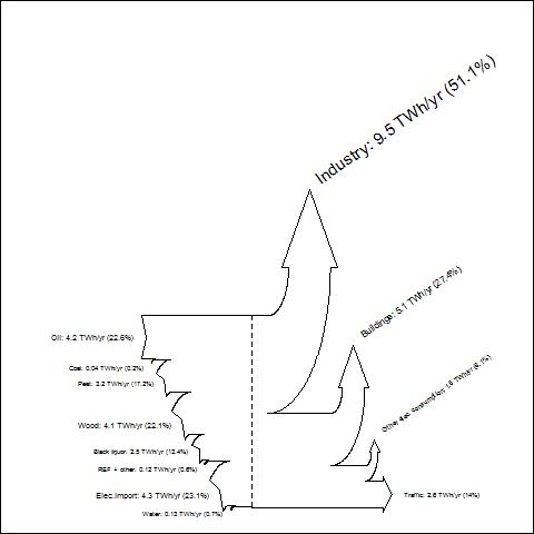
As a data source I will use  Central Finlands energy balance 2010 data.

Source of data you will find from this address: Keski-Suomen energiatase 2010

Ok let’s start to rock with R

To produce Sankey with R we use Function SankeyR (you will find same source as I use in this example from here)

We run first SankeyR function. Copy following code into your RGui.


SankeyR <- function(inputs, losses, unit, labels, format="plot"){
 ########################
 # SankeyR version 1.01 (updated August 10, 2010)
 # is a function for creating Sankey Diagrams in R.
 # See http://www.sankey-diagrams.com for excellent examples of Sankey Diagrams.
 #
 # OPTIONS:
 # 'inputs' is a vector of input values
 # 'losses' is a vector of loss values
 # 'unit' is a string of the unit
 # 'labels' is a vector of the labels for inputs and losses
 # 'format' is the type of plotting:
 #   The default is "plot," which produces a plot in the R graphics device.
 #   Current alternate options include "pdf" and "bmp," which produce
 #   those file types under the name "Sankey.xxx" in the current directory.
 #
 # Inputs do not need to equal losses.  Any difference will be displayed
 # as a discrepancy in the height of the left and right sides of the diagram.
 # This capability enables the developer to examine imbalances in flows.
 # Percentages are a proportion of the inputs (so, the outputs might not equal 100%).
 #
 # EXAMPLE:
 # Try using these values for the global carbon cycle, from Schlesinger (1997):
 #  inputs = c(120,92)
 #  losses = c(45,75,90,1,6)
 #  unit = "GtC/yr"
 #  labels = c("GPP","Ocean assimilation","Ra","Rh","Ocean loss","LULCC","Fossil fuel emissions")
 #  SankeyR(inputs,losses,unit,labels)
 #
 # UPDATES:
 # 8/10/10 - Added drawing for only one input.
 #
 # CREDITS:
 # Created for R by Aaron BERDANIER
 # send questions or comments to
 # aaron.berdanier@gmail.com
 #
 # SankeyR is based strongly on drawSankey for Matlab,
 # from James SPELLING, KTH-EGI-EKV (spelling@kth.se)
 # http://leniwiki.epfl.ch/index.php/DrawSankey
 #
 # Distributed under Creative Commons Attribution Non-Commercial.
 # Licensees may copy, distribute, display, and perform the work and make
 # derivative works based on it only for noncommercial purposes.
 #
 # Aaron would appreciate notification if you modify or improve this function.
 ########################
# Calculate fractional losses and inputs
 frLosses = losses/sum(inputs)
 frInputs = inputs/sum(inputs)
# First input and last output labels
 inputLabel = paste(labels[1],": ",inputs[1]," ",unit," (",round(100*frInputs[1],digits=1),"%)",sep="")
 lossLabel = paste(labels[length(labels)],": ",losses[length(losses)]," ",unit," 
(",round(100*frLosses[length(losses)],digits=1),"%)",sep="")
########################
 # Calculate position of plot axes (repeat of annotated code below; alternative: save values as vectors...)
 limTop = frInputs[1]; posTop = 0.4; maxy=0
 limBot = 0; posBot = 0.1
 if(length(inputs)>1){
 for(j in 2:length(inputs)){
 rI = max(0.07, abs(frInputs[j]/2))
 rE = rI + abs(frInputs[j])
 newPosB = posBot + rE*sin(pi/4) + 0.01
 posBot = newPosB
 arcEx = posBot - rE*sin(seq(0,pi/4,length.out=100))
 arcEy = limBot - rE*(1-cos(seq(0,pi/4,length.out=100)))
 arcIx = posBot - rI*sin(seq(0,pi/4,length.out=100))
 arcIy = limBot - rE + rI*cos(seq(0,pi/4,length.out=100))
 phiTip = pi/4 - 2*min(0.05, 0.8*abs(frInputs[j]))/(rI + rE)
 xTip = posBot - (rE+rI)*sin(phiTip)/2
 yTip = limBot - rE + (rE+rI)*cos(phiTip)/2
 limBot = limBot - frInputs[j]
 }
 }else{}
 posTop = posBot + 0.4
 for(i in 1:(length(losses)-1)){
 rI = max(0.07, abs(frLosses[i]/2))
 rE = rI + abs(frLosses[i])
 arcIx = posTop + rI*sin(seq(0,pi/2,length.out=100))
 arcIy = limTop + rI*(1 - cos(seq(0,pi/2,length.out=100)))
 arcEx = posTop + rE*sin(seq(0,pi/2,length.out=100));
 arcEy = (limTop + rI) - rE*cos(seq(0,pi/2,length.out=100))
 arEdge = max(0.015, rI/3)
 arTop  = max(0.04, 0.8*frLosses[i])
 arX = posTop + rI + c(0,-arEdge,frLosses[i]/2,frLosses[i]+arEdge,frLosses[i])
 arY = limTop + rI + c(0,0,arTop,0,0)
 if(max(arY)>maxy){maxy = max(arY)}else{maxy=maxy}
 limTop = limTop - frLosses[i]
 newPos = posTop + rE + 0.01
 posTop = newPos
 }
 newPos = max(posTop, posBot) + max(0.05*limTop,0.05)
 newPos = newPos + 0.8*(limTop-limBot)
maxx = newPos
 miny = (limTop-frLosses[length(frLosses)])-max(0.015,abs(frLosses[length(frLosses)]/4))
 maxy = maxy*2
 minx = 0
########################
 # Graphics type?
 if(format!="plot"){
 # Call graphics device
 plottype = switch(format,
 "pdf" = pdf("Sankey.pdf", width=11, height=min(8.5,11*(maxy-miny)/((maxx+3)-minx))),
 "bmp" = bmp("Sankey.bmp", width=800*((maxx+3)-minx)/(maxy-miny), height=800, unit="px",res=144)
 )
 }
# Create plotting window
 par(mar=c(0,0,0,0),oma=c(0,0,0,0))
 plot(0,0,type="n",xlim=c(-1.5,maxx+1.5),ylim=c(miny,maxy),xaxt="n",yaxt="n")
w = 1 # line width
# Calculate fractional losses and inputs
 frLosses = losses/sum(inputs)
 frInputs = inputs/sum(inputs)
# Draw back edge of first input arrow
 lines(c(0.1,0,0.05,0,0.4), c(0,0,frInputs[1]/2,frInputs[1],frInputs[1]),lwd=w)
# First input label
 inputLabel = paste(labels[1],": ",inputs[1]," ",unit," (",round(100*frInputs[1],digits=1),"%)",sep="")
 fontsize = max(0.5,frInputs[1]*2.5)
 text(0, frInputs[1]/2, inputLabel, cex=fontsize, pos=2) # try pos=4
# Set initial position for the top of the arrows
 limTop = frInputs[1]; posTop = 0.4; maxy=0
# set initial position for the bottom of the arrows
 limBot = 0; posBot = 0.1
###
 # DRAW ARROWS FOR ADDITIONAL INPUTS
 if(length(inputs)>1){
 for(j in 2:length(inputs)){
# determine inner and outer arrow radii
 rI = max(0.07, abs(frInputs[j]/2))
 rE = rI + abs(frInputs[j])
 # push separation point forwards
 newPosB = posBot + rE*sin(pi/4) + 0.01
 lines(c(posBot,newPosB), c(limBot,limBot), lwd=w)
 posBot = newPosB
 # determine points on the external arc
 arcEx = posBot - rE*sin(seq(0,pi/4,length.out=100))
 arcEy = limBot - rE*(1-cos(seq(0,pi/4,length.out=100)))
 # determine points on the internal arc
 arcIx = posBot - rI*sin(seq(0,pi/4,length.out=100))
 arcIy = limBot - rE + rI*cos(seq(0,pi/4,length.out=100))
 # draw internal and external arcs
 lines(arcIx, arcIy, lwd=w)
 lines(arcEx, arcEy, lwd=w)
# determine arrow point tip
 phiTip = pi/4 - 2*min(0.05, 0.8*abs(frInputs[j]))/(rI + rE)
 xTip = posBot - (rE+rI)*sin(phiTip)/2
 yTip = limBot - rE + (rE+rI)*cos(phiTip)/2
 # draw back edge of additional input arrows
 lines(c(min(arcEx),xTip,min(arcIx)), c(min(arcEy),yTip,min(arcIy)), lwd=w)
# Draw label
 phiText = pi/2-2*min(0.05,0.8*abs(frInputs[j]))/(rI+rE)
 xText = posBot-(rE+rI)*sin(phiText)/3
 yText = limBot-rE/1.5+(rE+rI)*cos(phiText)/2
 fullLabel = paste(labels[j],": ",inputs[j]," ",unit," (",round(100*frInputs[j],digits=1),"%)",sep="")
 fontsize = max(0.5,frInputs[j]*2.5)
 text(xText, yText, fullLabel, cex=fontsize, pos=2)
# save new bottom end of arrow
 limBot = limBot - frInputs[j]
 }
posTop = posBot + 0.4
lines(c(0.4,posTop), c(frInputs[1],frInputs[1]), lwd=w)
lines(c(posBot,posBot+(posTop-posBot)/2), c(limBot,limBot),lwd=w)
posMid=posBot+(posTop-posBot)/2
}else{
 lines(c(posBot,posBot+(posTop-posBot)/2), c(limBot,limBot),lwd=w)
 posMid=posBot+(posTop-posBot)/2
 }
###
 # DRAW ARROWS OF LOSSES
 for(i in 1:(length(losses)-1)){
# Determine inner and outer arrow radii
 rI = max(0.07, abs(frLosses[i]/2))
 rE = rI + abs(frLosses[i])
 # Determine points on the internal arc
 arcIx = posTop + rI*sin(seq(0,pi/2,length.out=100))
 arcIy = limTop + rI*(1 - cos(seq(0,pi/2,length.out=100)))
 # Determine points on the internal arc
 arcEx = posTop + rE*sin(seq(0,pi/2,length.out=100));
 arcEy = (limTop + rI) - rE*cos(seq(0,pi/2,length.out=100))
 # Draw internal and external arcs
 lines(arcIx, arcIy, lwd=w)
 lines(arcEx, arcEy, lwd=w)
# Determine arrow tip dimensions
 arEdge = max(0.015, rI/3)
 arTop  = max(0.04, 0.8*frLosses[i])
 # Determine points on arrow tip
 arX = posTop + rI + c(0,-arEdge,frLosses[i]/2,frLosses[i]+arEdge,frLosses[i])
 arY = limTop + rI + c(0,0,arTop,0,0)
 if(max(arY)>maxy){maxy = max(arY)}else{maxy=maxy}
 # Draw tip of losses arrow
 lines(arX, arY, lwd=w)
# Draw label
 txtX = posTop + rI + frLosses[i]/2
 txtY = limTop + rI + arTop + 0.05
 fullLabel = paste(labels[i+length(inputs)],": ",losses[i]," ",unit," 
(",round(100*frLosses[i],digits=1),"%)",sep="")
 fontsize = max(0.5,frLosses[i]*2.5)
 text(txtX, txtY, fullLabel, cex=fontsize, pos=4, srt=35)
# Save new position of arrow top
 limTop = limTop - frLosses[i]
 # Advance to new separation point
 newPos = posTop + rE + 0.01
 # Draw top line to new separation point
 lines(c(posTop,newPos), c(limTop,limTop), lwd=w)
 # Save new advancement point
 posTop = newPos
# SEPARATION LINES - not implemented yet
}
###
 # Push the arrow forwards a little after all side-arrows drawn
 newPos = max(posTop, posBot) + max(0.05*limTop,0.05)
 # Draw lines to this new position
 lines(c(posTop,newPos), c(limTop,limTop),lwd=w)
 lines(c(posMid,newPos), c(limTop-frLosses[length(frLosses)],limTop-frLosses[length(frLosses)]),lwd=w)
# Draw final arrowhead for the output
 lines(c(newPos,newPos,newPos+max(0.04,0.8*(frLosses[length(frLosses)])),newPos,newPos), 
c(limTop,limTop+max(0.015,abs(frLosses[length
(frLosses)]/6)),limTop-frLosses[length(frLosses)]/2,(limTop-frLosses[length(frLosses)])-max(0.015,
abs(frLosses[length(frLosses)]/6)),(limTop-frLosses
[length(frLosses)])),  lwd=w)
# Save final tip position
 newPos = newPos + 0.8*(frLosses[length(frLosses)])
# Last loss label
 lossLabel = paste(labels[length(labels)],": ",losses[length(losses)]," ",unit," 
(",round(100*frLosses[length(losses)],digits=1),"%)",sep="")
 fontsize = max(0.5,frLosses[length(losses)]*2.5)
 text(newPos+0.05, limTop-frLosses[length(frLosses)]/2, lossLabel, cex=fontsize, pos=4) # try pos=4
# Draw mid-line
 if(limBot<(limTop-frLosses[length(frLosses)])){
 lines(c(posMid,posMid), c(frInputs[1],limBot),lty=2)
 }else{
 lines(c(posMid,posMid), c(frInputs[1],limTop-frLosses[length(frLosses)]),lty=2)
 }
if(format!="plot"){
 # Close graphics device
 dev.off()
 }}


After that “Gui-run” we use Central Finlands energy balance data from year 2010…

#Central Finlands energy balance 2010 (Keski-Suomen energiatase 2010 Source: http://www.kesto.fi)
 #
 # inputs
 #Oil 4.2 TWh
 #Coal 0,04
 #Peat 3.2
 #Wood fuel 4.1
 #Black ? 2.5
 #REF + other 0.12
 #Water 0.13
 #Elec.import 4.3
# lossess
 #Industry 9.5
 #--> Elec 4,65
 #--> process heat 4,85
#Buildings 5.1
 #--> district heating 2.55
 #--> wood 0.663
 #--> oil 0.969
 #--> elec 0,867
 #Other elec consumption 1.5
 #Traffic 2.6
 #--> Bensin  1.196
 #--> Diesel 1.404
 #total 18.6 TWh
inputs = c(4.2,0.04,3.2,4.1,2.5,0.12,4.3,0.13)
 losses = c(9.5,5.1,1.5,2.6)
 unit = "TWh/yr"
 labels = c("Oil","Coal","Peat","Wood","Black liquor","REF + other","Elec.import","Water", 
"Industry","Buildings", "Other elec. consumption", "Traffic")
 SankeyR(inputs,losses,unit,labels)
#saving into file jpg. note: picture quality not so good
 jpeg(".../energybalance.jpg")
 SankeyR(inputs,losses,unit,labels)
 dev.off()
#saving into file note: picture quality not so good
 png(".../energybalance.png")
 SankeyR(inputs,losses,unit,labels)
 dev.off()
#saving into file note: note: picture quality not so good
 bmp(".../energybalance.bmp")
 SankeyR(inputs,losses,unit,labels)
 dev.off()
#saving into file note: picture quality excellent
 pdf(".../energybalance.pdf")
 SankeyR(inputs,losses,unit,labels)
 dev.off()

Result is ok, but just now I have no idea how to produce “sub-branches” of losses. Anyway very nice routine to produce Sankey….And here you will find Sankey diagram in pdf format energybalance.

Have fun,
Marko

R and Eurostat bulk data (Heatmap example)

R and Eurostat bulk data

In this Exercise I am testing Eurostat bulk data source and plot these data into Heatmap. Let’s try with this data:
“Harmonised unemployment rates (%) – monthly data (ei_lmhr_m)”

#You will also find Eurostat Data source from here:
http://epp.eurostat.ec.europa.eu/portal/page/portal/statistics/bulk_download


#I will automate this data downloading and extracting, but just now this is semiautomatic
# create download directory and set it
.exdir = 'c:/data/tmp2' # put there your own data folder
dir.create(.exdir)
.file = file.path(.exdir, 'ei_lmhr_m.tsv.gz') # change this

# download file
url = 'http://epp.eurostat.ec.europa.eu/NavTree_prod/everybody/BulkDownloadListing?sort=1&downfile=data

%2Fei_lmhr_m.tsv.gz'
download.file(url, .file)

# untar it (Note: I do not know why I got error message: Error in getOct(block, 100, 8) : invalid octal digit)
untar(.file, compressed = 'gzip', exdir = path.expand(.exdir))

# Argh...something going wrong with this step, so I have to manipulate just downloaded data. First I remove comma

# from very first variables and etc... I always use Notetab light as a Text editor in this kind of task.

# Reading file into R. Please refer here your own data folder...
input <- read.table("c:/data/tmp2/ei_lmhr_m.tsv", header=TRUE, sep="\t", na.strings=":", dec=".", strip.white=TRUE)

#just checking
head(input)


# LM-UN-T-TOT = Unemployment rate according to ILO definition - Total rate

# NSA = not seasonally adjusted
input<- input[which(input$indic=="LM-UN-T-TOT"),]
input<- input[which(input$s_adj=="NSA"),]

#giving appropriate names in to the heatmap (without this manouver there will be only row id)
row.names(input) <- input$geo.time

#just checking
head(input)

#Column selection. We will get data between time period 05/2008 - 05/2012

input2 <- input[,5:53]

# data frame must change into data matrix  to produce heatmap.
input_matrix <- data.matrix(input2)

#heatmap is almost here
input_heatmap <- heatmap(input_matrix, Rowv=NA, Colv=NA, col = heat.colors(256), scale="column", margins=c

(5,10), xlab = "Harmonised unemployment rates (%) - monthly data", ylab= "Country or Area")


#saving heatmap into folder
jpeg("G:/data/home/2012/marko/blogi_rbloggerqvist/data/eurostat/Harmonised unemployment rates percent

monthly data.jpg")
input_heatmap <- heatmap(input_matrix, Rowv=NA, Colv=NA, col = heat.colors(256), scale="column", margins=c

(5,10), xlab = "Harmonised unemployment rates (%) - monthly data", ylab= "Country or Area")
dev.off()

Have fun,
Marko

R and population maps in Finland 31.5.2012

This example source is almost same like this. I used at first time sorvi-package. In this example I modified little bit original and try to compare MML and GADM shape – files. As we know there is some need to updates into GADM shapefiles (as you will see). Datafiles source date is 31.05.2012 from Väestörekisterikeskus. Thanks to Louhos -people and their invaluable work within open -data project.

# library sorvi You will find there

library(sorvi)
library(rgeos)
library(rgdal)
if (!gpclibPermit()) { gpclibPermit() }

# Finland map and municipility data at gadm-format
gadm <- GetGADM(“FIN_adm”, “Kunta”)

##now we use also MML as data source (shape) because of compare shape files
# (C) MML 2011
data(MML)
sp <- MML[[“1_milj_Shape_etrs_shape”]][[“kunta1_p”]]

# vaestorekisteri population data from data source vrk.fi  31.05.2012
vrek <- GetPopulationRegister(“http://vrk.fi/default.aspx?docid=6706&site=3&id=0”)

# Attach vrk data into map object and
# set population as zero where na
gadm$asukkaita <- log10(rowSums(vrek[gadm$Kunta, c(“Miehet”, “Naiset”)]))
gadm$asukkaita[is.na(gadm$asukkaita)] <- 0

sp$asukkaita <- log10(rowSums(vrek[sp$Kunta, c(“Miehet”, “Naiset”)]))
sp$asukkaita[is.na(sp$asukkaita)] <- 0

# male and female share
gadm$miehet.osuus <- vrek[gadm$Kunta, “Miehet”]/vrek[gadm$Kunta, “Yhteensa”]
gadm$naiset.osuus <- vrek[gadm$Kunta, “Naiset”]/vrek[gadm$Kunta, “Yhteensa”]

gadm_summary_male <- summary(vrek[gadm$Kunta, “Miehet”]/vrek[gadm$Kunta, “Yhteensa”])
gadm_summary_female <- summary(vrek[gadm$Kunta, “Naiset”]/vrek[gadm$Kunta, “Yhteensa”])

sp$miehet.osuus <- vrek[sp$Kunta, “Miehet”]/vrek[sp$Kunta, “Yhteensa”]
sp$naiset.osuus <- vrek[sp$Kunta, “Naiset”]/vrek[sp$Kunta, “Yhteensa”]

sp_summary_male <- summary(vrek[sp$Kunta, “Miehet”]/vrek[sp$Kunta, “Yhteensa”])
sp_summary_female <- summary(vrek[sp$Kunta, “Naiset”]/vrek[sp$Kunta, “Yhteensa”])

#some summary stat

gadm_summary_male
gadm_summary_female
sp_summary_male
sp_summary_female

hist_gadm_male <- hist(gadm$miehet.osuus)
hist_gadm_female <- hist(gadm$naiset.osuus)
hist_sp_male <- hist(sp$miehet.osuus)
hist_sp_female <- hist(sp$naiset.osuus)

plot(density(gadm$miehet.osuus,na.rm=TRUE))
plot(density(gadm$naiset.osuus,na.rm=TRUE))
plot(density(sp$miehet.osuus,na.rm=TRUE))
plot(density(sp$naiset.osuus,na.rm=TRUE))

#saving hist figure into file …\r_maps
jpeg(“…/hist.jpg”)
layout(matrix(1:4,2,2))
hist_gadm_male <- hist(gadm$miehet.osuus)
hist_gadm_female <- hist(gadm$naiset.osuus)
hist_sp_male <- hist(sp$miehet.osuus)
hist_sp_female <- hist(sp$naiset.osuus)
dev.off()

#saving density figre into file …\r_maps (replace … as your fav. folder)
jpeg(“…/density.jpg”)
layout(matrix(1:4,2,2))
plot(density(gadm$miehet.osuus,na.rm=TRUE))
plot(density(gadm$naiset.osuus,na.rm=TRUE))
plot(density(sp$miehet.osuus,na.rm=TRUE))
plot(density(sp$naiset.osuus,na.rm=TRUE))
dev.off()

# set share  50% male/female
# where na
gadm$miehet.osuus[is.na(gadm$miehet.osuus)] <- 0.5
gadm$naiset.osuus[is.na(gadm$naiset.osuus)] <- 0.5

#same with MML

sp$miehet.osuus[is.na(sp$miehet.osuus)] <- 0.5
sp$naiset.osuus[is.na(sp$naiset.osuus)] <- 0.5

# border of interval GADM
varname1 <- “naiset.osuus”
interval1 <- max(abs(gadm[[varname1]] – 0.5))
at1 <- seq(0.5 – interval1, 0.5 + interval1, length = 100)

#border of interval MML

varname2 <- “naiset.osuus”
interval2 <- max(abs(sp[[varname2]] – 0.5))
at2 <- seq(0.5 – interval2, 0.5 + interval2, length = 100)

#PLOTTING INTO FILE

jpeg(“j:/todo/r_maps/gadm_280612.jpg”)
q1 <- PlotShape(gadm, varname1, type = “twoway”, at = at1, main = “Share of women (red) and men (blue) 31.05.2012 n=437 (GADM)”)
dev.off()

jpeg(“j:/todo/r_maps/mml_280612.jpg”)
q2 <- PlotShape(sp, varname2, type = “twoway”, at = at2, main = “Share of women (red) and men (blue) 31.05.2012 n=337 (MML)”)
dev.off()

#Which one is best?

GADM projection is not like “normal” and MML coastline is little bit odd, but I am patiently looking forward to improvement  into this issue….

ME/290612


R and VIX index

Using R as visualizing Volatility Index VIX

On September 22, 2003, the CBOE began disseminating price level information using revised methodology for the CBOE Volatility Index, VIX. A spreadsheet with more than 13 years of price history data using this new methodology is now available.

VIX?

In 1993, the Chicago Board Options Exchange® (CBOE®) introduced the CBOE Volatility Index®, VIX®, and it quickly became the benchmark for stock market volatility. It is widely followed and has been cited in hundreds of news articles in the Wall Street Journal, Barron’s and other leading financial publications. Since volatility often signifies financial turmoil, VIX is often referred to as the “investor fear gauge”.
Source: http://www.cboe.com/micro/vix/faq.aspx#1

So, I found this example from there. I change it little bit. In this exampele it use whole time series you will found there. Now let’s look at closer this amazing approach…

#required library
require(quantmod)
require(ggplot2)
require(reshape2)
require(plyr)
require(scales)

# download data source
input <- read.table("http://www.cboe.com/publish/ScheduledTask/MktData/datahouse/vixcurrent.csv", header=TRUE, sep=",", na.strings="NA", dec=".", strip.white=TRUE)

# creating dataframe
dat<-data.frame(date=index(VIX),VIX)
#look what we get
head(dat)

#date conversation
input$date <- as.Date(input$Date, "%m/%d/%Y")

## below some example do to that
## read in date/time info in format 'm/d/y h:m:s'
## dates <- c("02/27/92", "02/27/92", "01/14/92", "02/28/92", "02/01/92")
## times <- c("23:03:20", "22:29:56", "01:03:30", "18:21:03", "16:56:26")
## x <- paste(dates)
## y <- strptime(x, "%m/%d/%y")

# extract year
input$year<-as.numeric(as.POSIXlt(input$date)$year+1900)

# and  the month too OK
input$month<-as.numeric(as.POSIXlt(input$date)$mon+1)

# monts into right order and giving factor name
input$monthf<-factor(input$month,levels=as.character(1:12),labels=c("Jan","Feb","Mar","Apr","May","Jun","Jul","Aug","Sep","Oct","Nov","Dec"),ordered=TRUE)

# week days
input$weekday = as.POSIXlt(input$date)$wday

# week day ordering and gibing factor name (weekdays)
input$weekdayf<-factor(input$weekday,levels=rev(1:7),labels=rev(c("Mon","Tue","Wed","Thu","Fri","Sat","Sun")),ordered=TRUE)

# yearmonth
input$yearmonth<-as.yearmon(input$date)
input$yearmonthf<-factor(input$yearmonth)

# week of year by rows
input$week <- as.numeric(format(input$date,"%W"))

# making week to start at number 1
input<-ddply(input,.(yearmonthf),transform,monthweek=1+week-min(week))

# Ok, Now we are ready to plot

P<- ggplot(input, aes(monthweek, weekdayf, fill = VIX.Close)) +
geom_tile(colour = "white") + facet_grid(year~monthf) + scale_fill_gradient(low="yellow", high="red") +
opts(title = "Heatmap - view of future expected stock market volatility (risk)") + xlab("Week of Month") + ylab("")

#show the plot
P

# save the picture
# example - output graph to jpeg file
jpeg("heatmaps.jpg")
P
dev.off()

...and output will look like this:

That’s it,

Cheers, Marko


R and Earthquake data

Earth quakes of the last 30 days

These example come from here. I follow instruction how to plot earthquage data into world map between 24.5. – 23.6.2012. My first test is not succesfull, so I make my copy paste tricks. Final result show now “right” magnitude.

## Plot world wide earth quakes of the last 30 days with magnitude >= 4.0
library(googleVis)
library(XML)
## Get earthquake data of the last 30 days
## That is ok, put for some reason I do not get right magnitude into picture.
eq=readHTMLTable(readLines("http://www.iris.edu/seismon/last30.html"))
eq <- eq[[2]] ## extract the eq table
summary(eq)
#something wrong with this  last30 file
#I have to copy and paste web-page data into Notepad and saved this into file earthquake.txt
#eq <- read.table("j:/todo/R_geodata/earthquake.txt", header=TRUE, sep="\t", na.strings="NA", dec=".", strip.white=TRUE)
#WEB-server datafile note I change MAG into magni
eq <- read.table("http://ekqvist.goeuropeinfo.com/rbloggerqvist/data/earthq/earthquake.txt", header=TRUE, sep="\t", na.strings="NA", dec=".", strip.white=TRUE)

# lat and lon must be the same variable
eq$loc=paste(eq$LAT, eq$LON, sep=":") ## create a lat:long location variable

# making geomap
earthq <- gvisGeoMap(eq, locationvar="loc", numvar="magni", hovervar="DATE", options=list(dataMode="markers"))

#plotting results into html file
#plot(earthq)
cat(earthq$html$chart, file="j:/todo/R_geodata/earthq.html")

By clicking this link you will see the result file.

Please, be patient because it takes about 30sec to open….

Greetings,

Marko


R and gVisGeoMap

Helppoa kuin heinänteko

Here in Finland we have phrase: ” Helppoa kuin heinänteko”. Now my purpose is to indicate what is the relation between this phrase and using R library googleVis.
In this example we use UN datasets from this source.

All datasets used in this examples You could download bloggerqvist server. Of course I encourage You to find appropriate UN dataset and find data within your interest.

Example1: Coke Oven gas production 2006-2009 (TJ)

################################################################
UN data source:
http://data.un.org/
Coke oven gas - production
################################################################
# setting amazing library
library(googleVis)
################################################################
# download data
input <- read.table("http://energy.goeuropeinfo.com/data/un_data/UNdata_Export_20120622_210218958.csv", header=TRUE, sep=";", na.strings="NA", dec=",", strip.white=TRUE)

#selecting yearly data
select09<- input[which(input$Year=="2009"),]
select08<- input[which(input$Year=="2008"),]
select07<- input[which(input$Year=="2007"),]
select06<- input[which(input$Year=="2006"),]

#selecting variables
Map09<- data.frame(select09$Country.or.Area, select09$Quantity)
Map08<- data.frame(select08$Country.or.Area, select08$Quantity)
Map07<- data.frame(select07$Country.or.Area, select07$Quantity)
Map06<- data.frame(select06$Country.or.Area, select06$Quantity)

#change variable name
names(Map09)<- c("Country", "Coke-oven gas prod. TJ")
names(Map08)<- c("Country", "Coke-oven gas prod. TJ")
names(Map07)<- c("Country", "Coke-oven gas prod. TJ")
names(Map06)<- c("Country", "Coke-oven gas prod. TJ")

#year 2009
unmap09=gvisGeoMap(Map09, locationvar="Country", numvar="Coke-oven gas prod. TJ", options=list(height=350, dataMode='regions', chartid="Coke-oven prod 2009"))
#year 2008
unmap08=gvisGeoMap(Map08, locationvar="Country", numvar="Coke-oven gas prod. TJ", options=list(height=350, dataMode='regions'))
#year 2007
unmap07=gvisGeoMap(Map07, locationvar="Country", numvar="Coke-oven gas prod. TJ", options=list(height=350, dataMode='regions'))
#year 2006
unmap06=gvisGeoMap(Map06, locationvar="Country", numvar="Coke-oven gas prod. TJ", options=list(height=350, dataMode='regions'))

#testing that all is ok
plot(unmap09)
plot(unmap08)
plot(unmap07)
plot(unmap06)

# saving just created map into html-file
cat(unmap09$html$chart, file="j:/todo/UN/undata_cokeoven_prod_TJ_2009.html")
cat(unmap08$html$chart, file="j:/todo/UN/undata_cokeoven_prod_TJ_2008.html")
cat(unmap07$html$chart, file="j:/todo/UN/undata_cokeoven_prod_TJ_2007.html")
cat(unmap06$html$chart, file="j:/todo/UN/undata_cokeoven_prod_TJ_2006.html")

Results file looks like this:
Map 2009, 2008, 2007 and 2006

Have fun,
Marko

…..oops Here Is also an another example….

Example2: Energy use (kg oil eqv per capita)

################################################################
UN data source:
http://data.un.org/
energy use
################################################################
library(googleVis)
input <- read.table("http://energy.goeuropeinfo.com/data/UNdata_Export_20120623_070334184_energyuse_kg_eqv_oil_per_capita.txt", header=TRUE, sep=";", na.strings="NA", dec=",", strip.white=TRUE)
# select year into matrices
select09<- input[which(input$Year=="2009"),]
select08<- input[which(input$Year=="2008"),]
select07<- input[which(input$Year=="2007"),]
select06<- input[which(input$Year=="2006"),]

#select area and value field
Map09<- data.frame(select09$Country.or.Area, select09$Value)
Map08<- data.frame(select08$Country.or.Area, select08$Value)
Map07<- data.frame(select07$Country.or.Area, select07$Value)
Map06<- data.frame(select06$Country.or.Area, select06$Value)

names(Map09)<- c("Country", "Energy Use Eqv oil kg per capita")
names(Map08)<- c("Country", "Energy Use Eqv oil kg per capita")
names(Map07)<- c("Country", "Energy Use Eqv oil kg per capita")
names(Map06)<- c("Country", "Energy Use Eqv oil kg per capita")

unmap09=gvisGeoMap(Map09, locationvar="Country", numvar="Energy Use Eqv oil kg per capita", options=list(height=350, dataMode='regions'))
unmap08=gvisGeoMap(Map08, locationvar="Country", numvar="Energy Use Eqv oil kg per capita", options=list(height=350, dataMode='regions'))
unmap07=gvisGeoMap(Map07, locationvar="Country", numvar="Energy Use Eqv oil kg per capita", options=list(height=350, dataMode='regions'))
unmap06=gvisGeoMap(Map06, locationvar="Country", numvar="Energy Use Eqv oil kg per capita", options=list(height=350, dataMode='regions', chartid="06"),chartid="06")

plot(unmap09)
plot(unmap08)
plot(unmap07)
plot(unmap06)


cat(unmap09$html$chart, file="j:/todo/UN/undata_energyuse_eqvkgpercapita_2009.html")
cat(unmap08$html$chart, file="j:/todo/UN/undata_energyuse_eqvkgpercapita_2008.html")
cat(unmap07$html$chart, file="j:/todo/UN/undata_energyuse_eqvkgpercapita_2007.html")
cat(unmap06$html$chart, file="j:/todo/UN/undata_energyuse_eqvkgpercapita_2006.html")

that’s it…

R and GoogleVision

Inspired with TED and Hans Rosling

I found this idea from TED.com where Hans Rosling gave an inspiring talk at TED about social and economic developments in the world over the last 50 years. Rosling visualise his talk in amazing way using animated bubble charts. After that (2010) this technology is also available all others  thanks to Google and R-package developers. You only need R version 2.11.0 or higher and googleVis -library >= 0.2.4 to do you own “bubble chart”.

Short introduction

googleVis is an R package providing an interface between R and the Google Visualisation API. All output of googleVis is html code that contains the data and references to JavaScript functions hosted by Google. You only need to upload this html file into your operators server and open your webbrowser. Voilaa…after that you could “rattle” your data with very new way.
Please, hold onto your hat now we go forward within this issue….

I was so facinated about this “bubble charting” technology that I decided to make also my own test. I have always want to know how energy production, air emissions, and GPD link together…so I collect data from Eurostat and UN to produce my own “bubble chart” from all EU-countries. Of course I calculated all dependent variables per population.

We need only few rows of code:
#first activate library in R
library(googleVis)

#download data from server. Note you have to first "manipulate" your data to appropriate format.

energia <- read.table("http://energy.goeuropeinfo.com/data/CEIP_CLRTAP_UN_UNFCCC_EUROSTAT_me_edited.csv", header=TRUE, sep=";", na.strings="NA", dec=",", strip.white=TRUE)
#lets check that everythin is ok
data(energia)

#after that just write code below to produce your bubble
energiadat <- gvisMotionChart(energia, "Maa", "Vuosi", options=list(width=730, height=540))
plot(energiadat)
cat(energiadat$html$chart, file="eu_ente_emissions.html")

#upload html file into your service provider server

Open Motion chart from here

In Motion chart you could choose four variables to present at the same time. To “run” this chart just push the play button.

By the way…I have also made one oral presentation in January by using motion chartting and belive me…audience ask me to show more and more motion…..

Have Fun,
Marko

Source cite:
1 Markus Gesmann and Diego de Castillo. Using the Google Visualisation API with R. The R Journal, 3(2):40-44, December 2011.

2 CEIP, CLRTAP, UN, UNFCCC and Eurostat emissons data.

Using R with examining apartment house energy consumption effectiveness (DEA effectiveness)

This example is test only. Data itself is “real” data and I think you could do that example also with own data if available. In this example I used library benchmarking.

First set the library and  download data from source

#################################
library(Benchmarking)
#################################
#DEA 1
#output haitakkeet huoneiston suhteen vesi, lämpö ja sähkö
#input vuokransuuruus, asuntojen lukumäärä
#/*lukee suoraan sas-ohjelman csv exportatun datan*/
deamk <- read.table(“http://ekqvist.goeuropeinfo.com/rbloggerqvist/data/deamk.csv”, header=TRUE, sep=”;”, na.strings=”NA”, dec=”,”,
strip.white=TRUE)

#dea1
x1 <- with(deamk, cbind(vuokra_e_nelio_kk, asuntoja)) #INPUT PANOKSET
x1 <- with(deamk, cbind(asuntoja, vuokra_e_nelio_kk)) #INPUT PANOKSET

x1 <- with(deamk, cbind(vuokra_e_nelio_kk)) #INPUT PANOKSET
y1 <- with(deamk, cbind(vesi_vrk_as_litraa, sahko_MWh, lampo_MWh)) # OUTPUT TUOTOKSET

dea.plot.frontier(x1,y1,txt=TRUE, main=”DEA Tehokkuusrintama HeKa aineistosta 2011″)
dea.plot(x1,y1)

#If you want graph into local folder change appropriate folder name below
# example – output graph to jpeg file
jpeg(“i:/todo/asuntodata_dea/deamk.jpg”)
dea.plot.frontier(x1,y1,txt=TRUE, main=”DEA Tehokkuusrintama HeKa aineistosta 2011″)
dev.off()

#note before that install “benchmarking” library
e_dea2011out <- dea(x1,y1, RTS=”vrs”, ORIENTATION=”out”)
e_dea2011in <- dea(x1,y1, RTS=”vrs”, ORIENTATION=”in”)   #TÄTÄ KÄYTETTY ANALYYSISITEKSTISSÄ

#saving results into file
#tehokkuusluvut tiedostoon
write.table(eff(e_dea2011out), file = “i:/todo/asuntodata_dea/e_dea2011out.txt”, sep = “\t”, col.names = NA, qmethod = “double”)
write.table(eff(e_dea2011in), file = “i:/todo/asuntodata_dea/e_dea2011in.txt”, sep = “\t”, col.names = NA, qmethod = “double”)

#..more informative by using summary
sink(“i:/todo/asuntodata_dea/summary_deamk.txt”)
summary(e_dea2011in)
sink()

#plotting effectiveness data with density graph
jpeg(“i:/todo/asuntodata_dea/dea1_density_mkkiinteistot.jpg”)
eff.dens.plot(e_dea2011in , main=”DEA tiheysjakauma HeKa 2011″)
dev.off()
#and same pic here


#070512

#we are also interested which variable explain most  best effectiveness..

#Meitä kiinnostaa myös mitkä valituista muuttujista selittävät parhaiten
# tehokkuutta
# vesi, lämpö ja sähkö, vuokransuuruus
#testataan tätä lineaarisella regressiolla
# yhdistetään eff tiedostoon alkuperäiset muuttujat
#luetaan eff tiedosto sellainsenaan edellä ajetusta

#here we read above effectiveness data table (note 1= best unit)
effvalmis <- read.table(“http://ekqvist.goeuropeinfo.com/rbloggerqvist/data/eff_dea2011valmis.txt”, header=TRUE, sep=”\t”, na.strings=”NA”, dec=”.”, strip.white=TRUE)
#in this operation we could use merge and unique link variable “id”
yhdista1 <- merge(deamk, effvalmis, by.x = “id”, by.y = “id”, all = TRUE)
attach(yhdista1)
names(yhdista1)
summary(yhdista1)

#Examine variables more details – TUTKITAAN MUUTTUJIA TARKEMMIN
hist(yhdista1$x)
hist(yhdista1$vuokra_e_nelio_kk)
hist(yhdista1$vesi_vrk_as_litraa)
hist(yhdista1$sahko_MWh)
hist(yhdista1$lampo_MWh)

#TUTKITAAN MUUTTUJIA TARKEMMIN
jpeg(“j:/todo/asuntodata_dea/hist_matriisikuva.jpg”)
layout(matrix(1:6,2,3))
hist(yhdista1$x)
hist(yhdista1$vuokra_e_nelio_kk)
hist(yhdista1$vesi_vrk_as_litraa)
hist(yhdista1$sahko_MWh)
hist(yhdista1$lampo_MWh)
dev.off()

#DENSITY
jpeg(“j:/todo/asuntodata_dea/density_matriisikuva.jpg”)
layout(matrix(1:6,2,3))
plot(density(yhdista1$x,na.rm=TRUE))
plot(density(yhdista1$vuokra_e_nelio_kk,na.rm=TRUE))
plot(density(yhdista1$vesi_vrk_as_litraa,na.rm=TRUE))
plot(density(yhdista1$sahko_MWh,na.rm=TRUE))
plot(density(yhdista1$lampo_MWh,na.rm=TRUE))
dev.off()

#SORTED VERSIO
jpeg(“j:/todo/asuntodata_dea/sorted_matriisikuva.jpg”)
layout(matrix(1:6,2,3))
plot(sort(yhdista1$x),pch=”1″)
plot(sort(yhdista1$vuokra_e_nelio_kk),pch=”2″)
plot(sort(yhdista1$vesi_vrk_as_litraa),pch=”3″)
plot(sort(yhdista1$sahko_MWh),pch=”4″)
plot(sort(yhdista1$lampo_MWh),pch=”5″)
dev.off()


#valitaan vain tietyt muuttujat pairs kuvaajaan
yhdista2 <- with(yhdista1, cbind(x, vuokra_e_nelio_kk, vesi_vrk_as_litraa, sahko_MWh, lampo_MWh)) #INPUT PANOKSET

#pairs
jpeg(“j:/todo/asuntodata_dea/pairs_matriisikuva.jpg”)
pairs(yhdista2)
dev.off()

#selitetään tehokkuuskerrointa panos ja tuotosmuuttujilla
sink(“i:/todo/asuntodata_dea/summary_deamk_fit_kaikki_muuttujat.txt”)
lm.r = lm(x ~ vuokra_e_nelio_kk + vesi_vrk_as_litraa + sahko_MWh + lampo_MWh)
summary(lm.r)
sink()


#vain tuotosmuuttujat
sink(“i:/todo/asuntodata_dea/summary_deamk_fit_vain_tuotos_muuttujat.txt”)
lm0.r = lm(x ~ vesi_vrk_as_litraa + sahko_MWh + lampo_MWh)
summary(lm0.r)
sink()


#kertoimet
coef(lm.r) # gives the model’s coefficients

#jäännöstermit eli kuinka paljon annetuilla arvoilla ennuste poikkeaa toteumasta
resid(lm.r) # gives the residual errors in Y

fitted(lm.r) # gives the predicted values for Y

#RESIDUAALIEN TUTKIMINEN

layout(matrix(1:4,2,2))
plot(lm.r)

#KAIKKI
jpeg(“i:/todo/asuntodata_dea/dea_residuaalitutkinta_mkkiinteistot_kaikki.jpg”)
layout(matrix(1:4,2,2))
plot(lm.r)
dev.off()

#VAIN TUOTOSMUUTTUJAT
jpeg(“i:/todo/asuntodata_dea/dea_residuaalitutkinta_mkkiinteistot_tuotosmuuttujat.jpg”)
layout(matrix(1:4,2,2))
plot(lm0.r)
dev.off()

#VUOKRA
jpeg(“i:/todo/asuntodata_dea/dea_residuaalitutkinta_mkkiinteistot_vuokra.jpg”)
layout(matrix(1:4,2,2))
plot(lm1.r)
dev.off()

#VESI
jpeg(“i:/todo/asuntodata_dea/dea_residuaalitutkinta_mkkiinteistot_vesi.jpg”)
layout(matrix(1:4,2,2))
plot(lm2.r)
dev.off()

#SÄHKÖ
jpeg(“i:/todo/asuntodata_dea/dea_residuaalitutkinta_mkkiinteistot_sahko.jpg”)
layout(matrix(1:4,2,2))
plot(lm3.r)
dev.off()

#LÄMPÖ
jpeg(“i:/todo/asuntodata_dea/dea_residuaalitutkinta_mkkiinteistot_lampo.jpg”)
layout(matrix(1:4,2,2))
plot(lm4.r)
dev.off()

#below in Finnish only

ennen kuin regressiomallin tulokset voisi hyväksyä, tulisi arvioida sen sopivuus
selittää dataa. yksi tapa toteuttaa tämä on tutkia residuaaleja visuaalisesti.
mikäli malli on soveltuva, tällöin residuaalivirheet tulisi olla satunnaisia ja
normaalisti jakautuneita.

Lisäksi, poistamalla “tapaus” one case ei tulisi merkittävästi vaikuttaa
mallin sopivuuteen. R mahdollistaa neljän graafisen esityksen tämän arvoimiseksi
käyttämällä plot komentoa.

upper left corner /vasen yläkulma
residuaalit vs mallilla sovitetut arvot. residuaalien tulisi olla satunnaisesti jakautuneita keskiviivan ympärillä. keskiviiva kuvaa virhearvoa nolla. pisteiden suhteen ei siis tulisi olla merkittävää hajontaa tämän viivan ympärillä.

lower left corner / vasen alakulma
standardi Q-Q kuvaaja, tämän kuvaajan tulisi vihjata ovatko residuaalivirheet
normaalisti jakautuneita.

upper right corner /oikea yläkulma
scale-location standardisoitujen residuaalien neliöjuuri (virhetermien tai virhee neliöjuuri) sovituksen tai mallin arvojen funktiona. tässäkin tapauksessa tässä ei tulisi olla tai nähtävissä selkeää trendiä. mikäli on, niin malli tulisi tarkistaa tai mahdollisesti poistaa outlier havaintoja.

lower right corner / oikea alakulma
näyttää jokaisen havainnon mitan eli  “vipuvaikutuksen” tai “voiman” kun määritetään regression tuottamia tuloksia. Cooks etäisyys kuvataan kahdella viivalla, joka on eräs mittari kuvaamaan havaintojen merkitsevyyttä regressiomallissa. pieni etäisyys tarkoittaa sitä, että havainnon / havaintojen poistamisella on vain pieni vaikutus regression tuloksiin. Etäisyydet, jotka ylittävät arvon yksi ovat kyseenalaisia ja viittaavat aineistossa mahdollisesti oleviin outliereihin tai muuten vääränlaiseen malliin (malliasetelmaan).

#Using the Results of a Regression to Make Predictions

vuokra_e_nelio_kk_new=c(3,4,4.5,4.6,4.5,5.5,6.9,5.8,3.6,4.7,5.3,6.2,5.1,3.9,4.3);vuokra_e_nelio_kk_new
predict(lm.r,data.frame(vuokra_e_nelio_kk = vuokra_e_nelio_kk_new), level = 0.9, interval = “confidence”)
where ‘lwr’ is the lower limit of the confidence interval and ‘upr’ is the upper limit of the confidence interval. R does not contain a feature for finding the confidence intervals for predicted values of the independent variable for specified values of dependent variables.

# data plotting as scatter plot/ pistekuvaaja näitä voidaan tehdä niin monta kuin on muuttujia

#SCATTER PLOT

jpeg(“j:/todo/asuntodata_dea/scatterplot_withoutfitline_rent.jpg”)
plot(x, vuokra_e_nelio_kk) dev.off()
plot(x, vesi_vrk_as_litraa)
plot(x, sahko_MWh)
plot(x, lampo_MWh)
plot(x, asuntoja)


#FITLINE / KUVAAJA FIT JA TOTEUTUNEET
lm1.r = lm(x ~ vuokra_e_nelio_kk)
plot(x ~ vuokra_e_nelio_kk, yhdista1)
abline(lm1.r$coef,lty=5)

lm2.r = lm(x ~ vesi_vrk_as_litraa)
plot(x ~ vesi_vrk_as_litraa, yhdista1)
abline(lm2.r$coef,lty=5)

lm3.r = lm(x ~ sahko_MWh)
plot(x ~ sahko_MWh, yhdista1)
abline(lm3.r$coef,lty=5)

lm4.r = lm(x ~ lampo_MWh )
plot(x ~ lampo_MWh, yhdista1)
abline(lm4.r$coef,lty=5)

lm5.r = lm(x ~ asuntoja)
plot(x ~ asuntoja, yhdista1)
abline(lm5.r$coef,lty=5)

# example – output graph to jpeg file
jpeg(“i:/todo/asuntodata_dea/fitline_vuokra.jpg”)
lm1.r = lm(x ~ vuokra_e_nelio_kk)
plot(x ~ vuokra_e_nelio_kk, yhdista1)
abline(lm1.r$coef,lty=5)
dev.off()

# example – output graph to jpeg file
jpeg(“i:/todo/asuntodata_dea/fitline_vesi.jpg”)
lm2.r = lm(x ~ vesi_vrk_as_litraa)
plot(x ~ vesi_vrk_as_litraa, yhdista1)
abline(lm2.r$coef,lty=5)
dev.off()

# example – output graph to jpeg file
jpeg(“i:/todo/asuntodata_dea/fitline_sahko.jpg”)
lm3.r = lm(x ~ sahko_MWh)
plot(x ~ sahko_MWh, yhdista1)
abline(lm3.r$coef,lty=5)
dev.off()

# example – output graph to jpeg file
jpeg(“i:/todo/asuntodata_dea/fitline_lampo.jpg”)
lm4.r = lm(x ~ lampo_MWh )
plot(x ~ lampo_MWh, yhdista1)
abline(lm4.r$coef,lty=5)
dev.off()

# example – output graph to jpeg file
jpeg(“i:/todo/asuntodata_dea/fitline_asuntoja.jpg”)
lm5.r = lm(x ~ asuntoja)
plot(x ~ asuntoja, yhdista1)
abline(lm5.r$coef,lty=6)
dev.off()

#IN THE SAME PICTURE / SAMAAN KUVAAN
jpeg(“i:/todo/asuntodata_dea/fitline_matriisikuva.jpg”)
layout(matrix(1:6,2,3))
lm1.r = lm(x ~ vuokra_e_nelio_kk)
plot(x ~ vuokra_e_nelio_kk, yhdista1)
abline(lm1.r$coef,lty=5)
lm2.r = lm(x ~ vesi_vrk_as_litraa)
plot(x ~ vesi_vrk_as_litraa, yhdista1)
abline(lm2.r$coef,lty=5)
lm3.r = lm(x ~ sahko_MWh)
plot(x ~ sahko_MWh, yhdista1)
abline(lm3.r$coef,lty=5)
lm4.r = lm(x ~ lampo_MWh )
plot(x ~ lampo_MWh, yhdista1)
abline(lm4.r$coef,lty=5)
lm5.r = lm(x ~ asuntoja)
plot(x ~ asuntoja, yhdista1)
abline(lm5.r$coef,lty=5)
dev.off()

#MUUTTUJAT SUHTEESSA TEHOKKUUSKERTOIMEEN
#LISÄKSI PIIRRETÄÄN KUNKIN MUUTTUJAN FIT-VIIVA
jpeg(“j:/todo/asuntodata_dea/fitline_kaikki_tuotosmuuttujat_samassakuvassa2.jpg”)
matplot(cbind(lampo_MWh,sahko_MWh,vesi_vrk_as_litraa),x,xlab=”x”,ylab=”y”)
#matplot(cbind(x,(lampo_MWh,sahko_MWh,vesi_vrk_as_litraa),xlab=”x”,ylab=”y”)
abline(lm4.r,lty=1)#LÄMPÖ
abline(lm3.r,lty=2)#SÄHKÖ
abline(lm2.r,lty=3)#VESI
dev.off()

Figure : Original x shown with “1”, with small error as “2” and with large error as “3”. The regression lines for the no measurement error, small error and large error are
shown as solid, dotted and dashed lines respectively.

#DENSITY / JAKAUMAT
jpeg(“i:/todo/asuntodata_dea/density_matriisikuva.jpg”)
layout(matrix(1:4,2,2))
plot(density(lampo_MWh,na.rm=TRUE))
plot(density(sahko_MWh,na.rm=TRUE))
plot(density(vesi_vrk_as_litraa,na.rm=TRUE))
dev.off()

#EXAMINING CORRELATION / KATSOTAAN VIELÄ KORRELAATIOT
data <- with(yhdista1, cbind(x, asuntoja, vuokra_e_nelio_kk, vesi_vrk_as_litraa, sahko_MWh, lampo_MWh))

# First Correlogram Example
jpeg(“i:/todo/asuntodata_dea/correlogram1_.jpg”)
library(corrgram)
corrgram(data, order=TRUE, lower.panel=panel.shade,
upper.panel=panel.pie, text.panel=panel.txt,
main=”DEA tehokkuuskertoimen (x) ja mallin muuttujien välinen korrelaatio”)
dev.off()

# Second Correlogram Example
# library(corrgram)
jpeg(“i:/todo/asuntodata_dea/correlogram2_.jpg”)
corrgram(data, order=TRUE, lower.panel=panel.ellipse,
upper.panel=panel.pts, text.panel=panel.txt,
diag.panel=panel.minmax,
main=”DEA tehokkuuskertoimen (x) ja mallin muuttujien välinen korrelaatio”)
dev.off()

# Third Correlogram Example
jpeg(“i:/todo/asuntodata_dea/correlogram3_.jpg”)
library(corrgram)
corrgram(data, order=NULL, lower.panel=panel.shade,
upper.panel=NULL, text.panel=panel.txt,
main=”DEA tehokkuuskertoimen (x) ja mallin muuttujien välinen korrelaatio”)
dev.off()

library(psych)
library(corrgram)

#PIIRRETÄÄN KUVAA
jpeg(“i:/todo/asuntodata_dea/matrix_scatterplots_.jpg”)
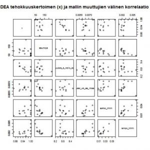
pairs(data, main=”DEA tehokkuuskertoimen (x) ja mallin muuttujien välinen korrelaatio”)   #draw a matrix of scatter plots for the first 5 variables
dev.off()

jpeg(“i:/todo/asuntodata_dea/histograms_for_all_variables_.jpg”)
multi.hist(data) #draw the histograms for all variables
dev.off()

jpeg(“i:/todo/asuntodata_dea/scatter_histograms_correlations_for_all_variables_.jpg”)
pairs.panels(data) #draws scatterplots, histograms, and shows correlations  (source found in the psych package)
dev.off()

That’s it…..

Copyright MySci 2024
Tech Nerd theme designed by Siteturner